The New Home for Finance Teams

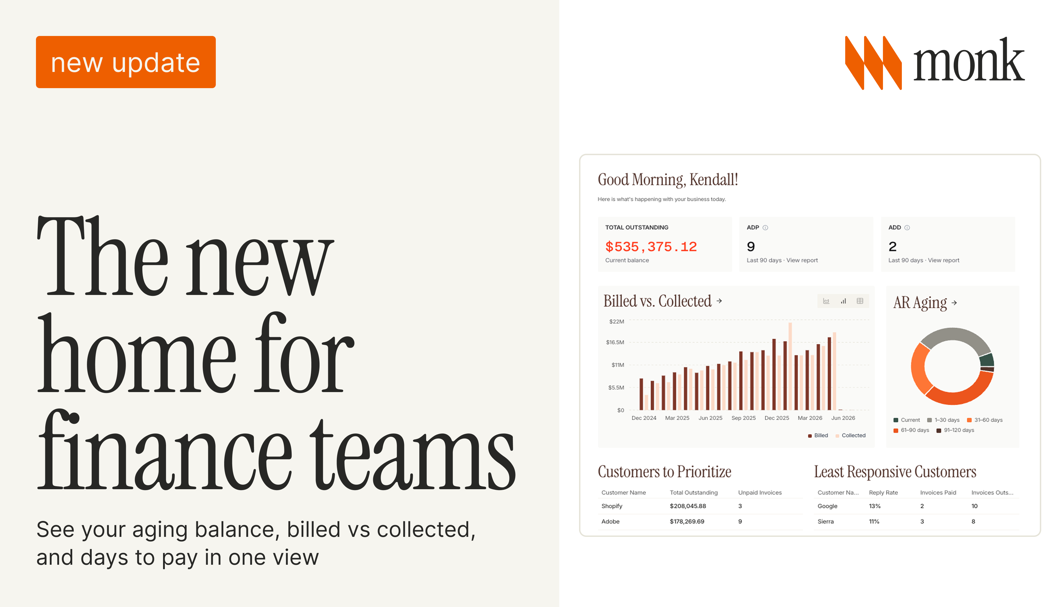
The first thing a finance team wants each morning is a straight answer to one question: where does our cash stand, and who do we need to chase today? The old home screen made you assemble that from a few different places. The new one puts it all in a single view.
What you see first
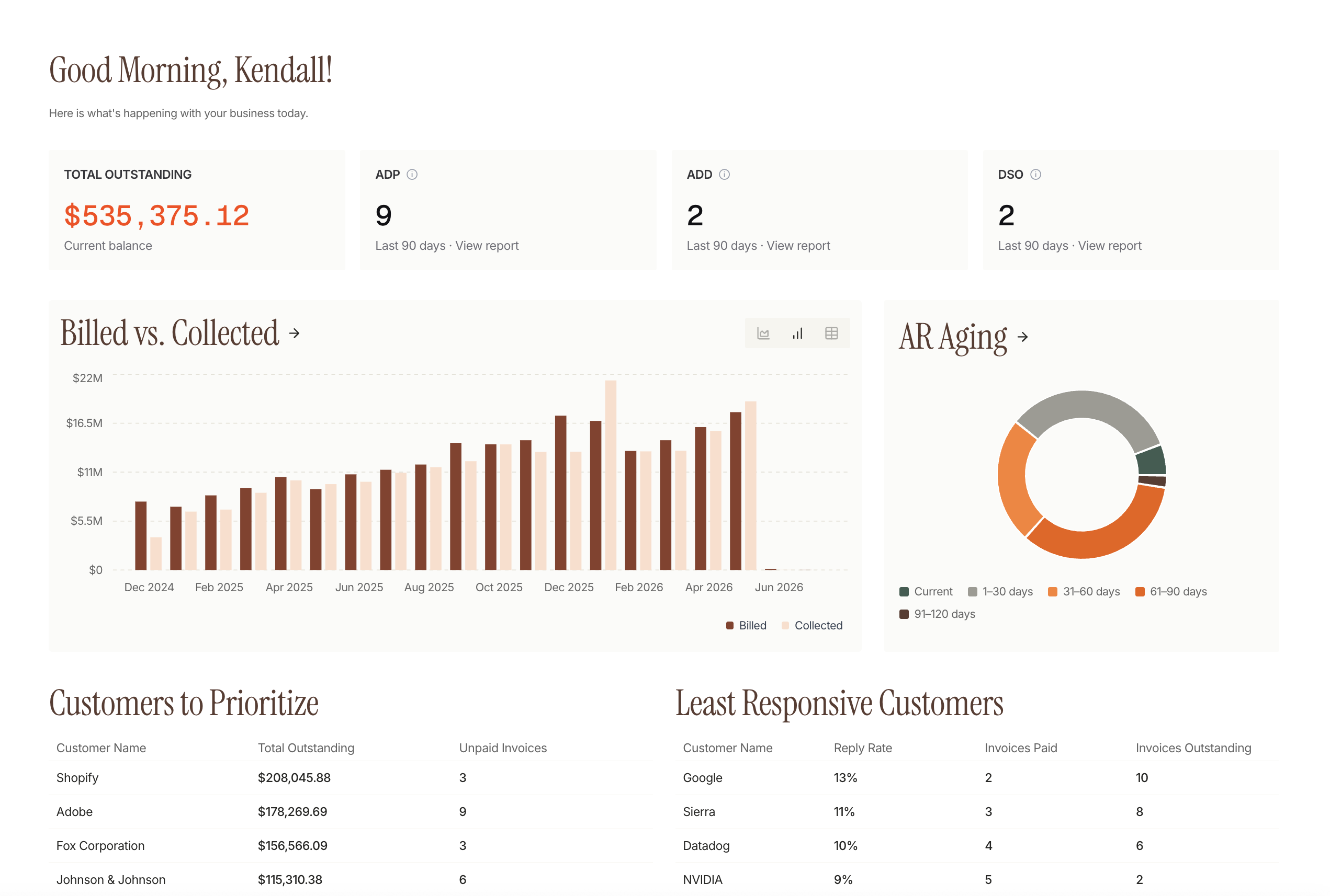
The top of the dashboard leads with the numbers that set the day: total outstanding balance, how many customers are overdue and need attention, and how many invoices and messages went out this week. It's the quick read on whether things are on track before you go any deeper.
Key Updates
Billed vs. collected, now side by side
The main view pairs what you've billed over time with what you've collected. Billed is broken out by customer so you can see where the volume is coming from, and cash collected is shown across 30, 60, and 90 days so you can see how quickly billings are turning into money in the account.
Aging and days to pay
The home screen added an overview on aging and Average Days to Pay, the two numbers that tell you how healthy your receivables are. Aging shows how much is current versus 30, 60, and 90-plus days out. Average Days to Pay shows how long customers take to complete an invoice, which is often a stronger signal than a single blended DSO. Collection rate and days sales outstanding sit alongside them, so the health of the book is readable at a glance.
Available as a preview
The new home is rolling out as an opt-in preview. You can switch to it, explore the richer collections and cash metrics, and switch back if you want. Try it from the banner at the top of your current home screen.
Frequently Asked Questions
What is the AR Overview dashboard?
It's Monk's home view for accounts receivable, rebuilt around AR aging, billed vs collected, and Average Days to Pay, with total outstanding, overdue customers, and cash collected surfaced up top.
What's the difference between DSO and Average Days to Pay?
DSO is a blended measure of how long receivables take to collect across the book. Average Days to Pay reflects how long customers actually take to pay, which often gives a clearer read on specific accounts.
How does the dashboard tell me who to chase?
It surfaces Customers to Prioritize, ranked by outstanding balance and unpaid invoices, and Least Responsive Customers, ranked by reply rate, so the next action is clear without building a report.
Do I have to switch to it?
No. It's available as an opt-in preview with a one-click way to switch back to the classic view.
See it on your own receivables. Book a demo.
Related reading: Introducing Cash Exceptions and Put AR on autopilot.
More on this: Introducing Playbook Previews: See the Next Draft Before It Sends and AR Analytics and Dashboards: A 2026 Guide.



.avif)