AR Analytics and Dashboards: A 2026 Guide

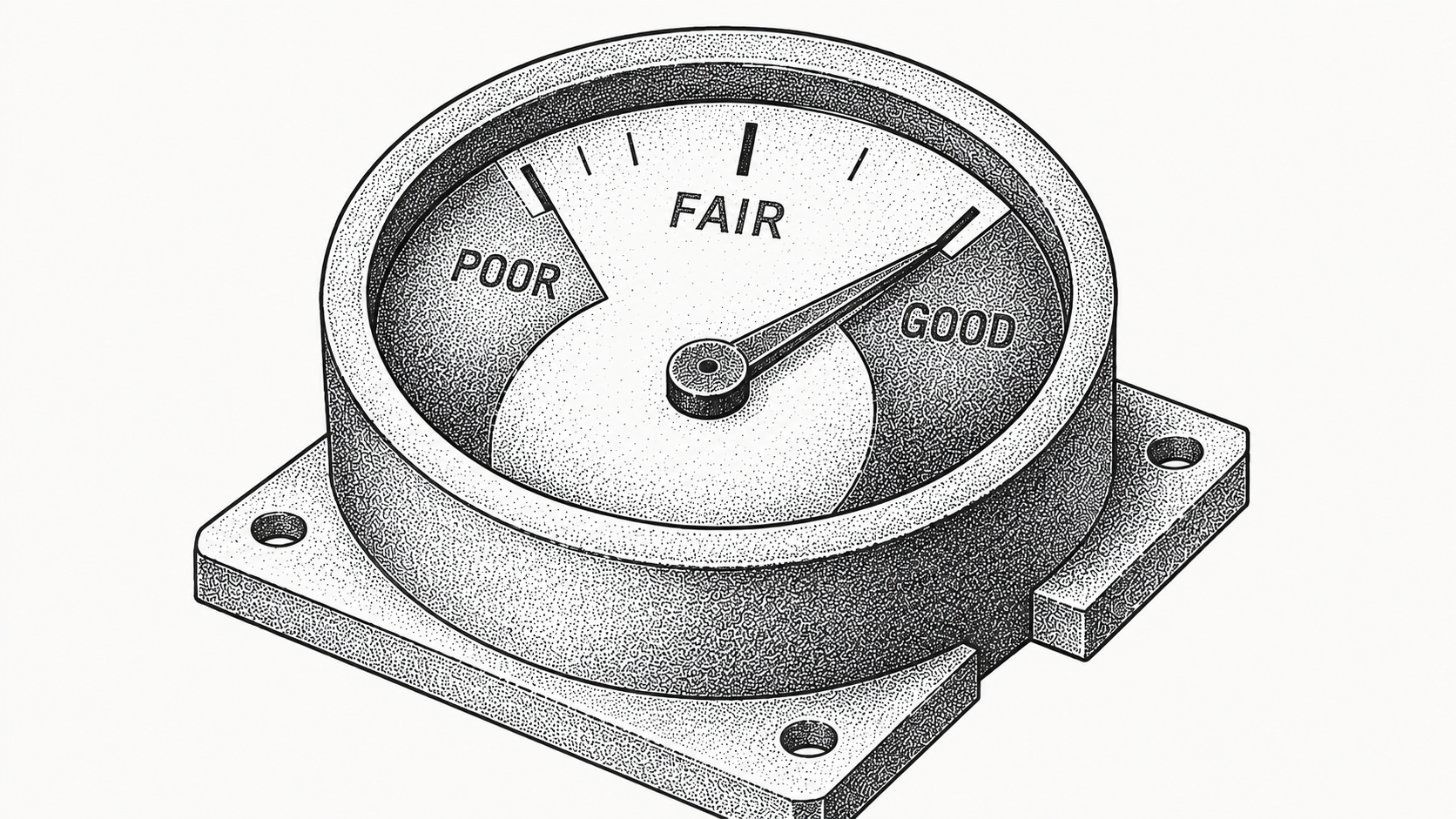
AR analytics is the practice of measuring, visualizing, and acting on accounts receivable data, and AR dashboards are the visual interfaces that make those metrics easy to read and share. Together they turn raw invoice and payment data into clear signals about collections health, cash flow, and customer payment behavior. Instead of exporting spreadsheets and reconciling numbers by hand at month-end, teams see current metrics every day and act on them quickly while there is still time to change the outcome.
In 2026, finance teams expect their receivables data to be current, visual, and tied to action. This guide explains the key metrics, the dashboard types that matter, and how to use them to get paid faster with a platform like Monk. For the wider context of how receivables automation works, our overview of what accounts receivable automation is sets the foundation.
What is AR analytics?
AR analytics is the analysis of accounts receivable data to understand how quickly invoices turn into cash, where collections risk sits, and how customer payment behavior is trending. It draws on invoice records, payment history, aging buckets, and dispute data to surface patterns a static report would hide.
Done well, it shifts AR from reactive chasing to proactive prioritization. Where a traditional aging report tells you what is overdue today, analytics tells you which accounts are trending the wrong way, which segments pay late as a pattern, and where a small intervention now prevents a write-off later. Dashboards are how those insights reach people, and a good dashboard answers a question at a glance: which accounts are slipping, where cash is concentrated, and whether collections effort is actually paying off. The goal is not more charts; it is fewer decisions made on a hunch.
What metrics belong on an AR dashboard?
The right metrics depend on your goals, but a few are foundational and worth tracking from day one. Each one answers a distinct question about the health of your receivables.
The table below lists common AR KPIs and what each one tells you, so you can choose the handful that map to your priorities rather than crowding a dashboard with every number you can pull. A common mistake is tracking so many metrics that none of them drives a decision; the strongest dashboards keep the headline numbers visible and push the detail one click away.
| Metric | What it measures | Why it matters |
|---|---|---|
| DSO | Average days to collect after a sale | Core indicator of collections speed |
| Aging buckets | Open balances by days overdue | Shows where risk and effort should focus |
| Collections effectiveness | Share of due receivables actually collected | Gauges how well outreach is working |
| Cash forecast | Expected incoming cash by period | Supports planning and liquidity decisions |
| Dispute rate | Share of invoices in dispute | Flags friction that delays payment |
What types of AR dashboards are there?
Most teams use a mix of dashboards because different roles ask different questions of the same data. One view rarely serves everyone.
An operational dashboard helps specialists prioritize daily work by showing the highest-impact overdue accounts and the next action on each. A management dashboard rolls up DSO, aging, and collections trends for AR leaders so they can spot whether the team is gaining or losing ground week over week. An executive view ties receivables to cash position and forecast for finance leadership, who care less about individual invoices and more about whether the cash will be there when the business needs it. The most useful dashboards update continuously rather than on a monthly cycle, so the picture a specialist acts on in the morning still reflects reality in the afternoon, and nobody wastes a call on an account that paid an hour ago.
Why does real-time data matter for AR?
Stale data leads to wasted effort. If a dashboard reflects last month, teams chase accounts that have already paid and miss accounts that just slipped past due.
Current data keeps prioritization accurate, so outreach lands where it matters and customers are not contacted about invoices they already settled. A single mistaken reminder to a customer who paid yesterday can undo months of relationship-building, and at scale those mistakes erode trust across the book. Timeliness also improves forecasting: when payments are applied promptly and metrics refresh continuously, the cash forecast reflects reality, which supports better liquidity decisions. This is why a high cash application match rate underpins good analytics. Monk reaches a 95% cash application match rate, which keeps the aging report and every downstream metric honest. The same principle applies to recovering revenue from failed charges, as our guide to Stripe failed payment recovery explains.
How do dashboards help teams get paid faster?
Dashboards turn data into prioritized action. By surfacing the highest-value overdue accounts and flagging emerging risk early, they let teams focus effort where it moves cash.
Monk customers have reduced DSO by 40% on average and reached 2.4x average cash on hand in their first quarter by acting on accurate, current receivables data rather than month-old reports. A dashboard that ranks accounts by recovery odds and dollar impact means a specialist always knows what to work next, so the limited hours in a day go to the invoices that move the needle most. Better visibility also reduces friction: when teams see dispute and short-payment patterns, they can fix root causes rather than re-chasing the same accounts month after month. The dashboard becomes a worklist, not just a report card.
How does AR analytics connect to automation?
Analytics and automation reinforce each other. Clean, current data makes a dashboard trustworthy, and automation is what keeps the data clean by applying cash and logging every collections action as it happens.
With Monk's automation, collections outreach, cash application, and dispute handling all feed the same live data set, so the dashboard reflects what the system has actually done, not what someone remembered to update. The AR agent Julia runs intelligent collections that ingest the context of conversations and respond more effectively than dunning, and every one of those actions becomes a data point on the dashboard. Because Monk connects natively to systems like QuickBooks, NetSuite, Salesforce, HubSpot, and Stripe, the numbers reconcile to your books rather than diverging from them over time. That tight loop between doing the work and measuring it is what separates a living dashboard from a static spreadsheet, and it is why analytics built on an automated platform stays trustworthy as volume grows.
How do you build an effective AR analytics practice?
Start with a small set of metrics that map to your goals, then make sure the underlying data is timely and accurate. Connect your invoicing and payment sources so dashboards reflect reality, and give each role the view it needs.
Monk customers typically reach a working go-live in 1 to 3 days, so teams can start acting on current data quickly rather than after a long implementation. From there, review metrics on a regular cadence and adjust priorities, and quantify the payoff using the framework in our guide to AR automation ROI. The goal is a practice that drives action, not just reporting, and Monk supports it as a SOC 2 compliant platform that never takes a percentage of your revenue.
Frequently Asked Questions
What is AR analytics?
It is the analysis of accounts receivable data to understand collections speed, risk, and customer payment behavior, so teams can prioritize work and get paid faster.
What are the most important AR metrics?
Common foundational metrics include DSO, aging buckets, collections effectiveness, cash forecast, and dispute rate, chosen to match your specific goals.
What is the difference between AR analytics and an AR dashboard?
Analytics is the analysis of receivables data, while a dashboard is the visual interface that makes those metrics easy to read, share, and act on.
Why does real-time AR data matter?
Current data keeps prioritization accurate so teams do not chase paid invoices, and it makes cash forecasts reflect reality for better planning.
How do dashboards help teams get paid faster?
They surface the highest-value overdue accounts and flag risk early, letting teams focus effort where it moves cash and reduce friction from disputes.
How does Monk keep AR dashboard data accurate?
Monk applies cash automatically with a 95% match rate and logs every collections action, so the dashboard reflects current reality rather than a month-old export.


.avif)